Coloring famous paintings: a beginner's guide
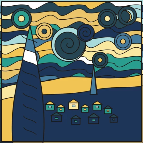
Coloring a line drawing inspired by a famous painting is a lovely way to look closely at art. You do not need to reproduce the original exactly; the goal is to understand what makes it memorable and to make it your own.
Look before you color
Spend a minute looking at the original painting in a book or museum website. Notice three things: the main colors, where the lightest part of the picture is, and the direction of movement. In The Starry Night the sky swirls, in The Great Wave the water rises and falls, and in the Water Lilies everything floats.
Start with the largest areas
Large areas such as the sky, the sea or the ground set the mood. Color them first, then the medium shapes, and leave tiny details for last. This order helps you avoid surprises when you realise the background clashes with everything you have already done.
Borrow the palette, not the details
Van Gogh's night is built on deep blues and warm yellows. Hokusai's wave uses Prussian blue, white foam and a pale sky. Monet's pond mixes greens, lilacs and soft pinks. Choose four or five colors from the original and stay within them; the picture will feel related to the original even if every area is different.
Make one bold choice
Once the main colors are in place, change one thing on purpose: a pink sky behind the cypress tree, a sunset over the wave, a night version of the water lilies. This is where coloring becomes creative rather than a copy.
A note on the originals
The paintings that inspire these drawings are in the public domain, which means they can be freely studied and reinterpreted. The line versions in Boya Bakalım are original simplified drawings, not tracings, so each one leaves room for your own colors.